A jet engine, directed as a protagonist.
Most engineering visuals treat the machine as a diagram. We treated it as a protagonist.
We made the film as if General Electric had shot it in a parallel universe — engineering seen as form, not function. There's very little emotion in engineering visuals: exploded views, callouts, a slow orbit around the product.
So the brief I wrote for the team was one question: not how a jet engine works, but what it feels like to stand next to one. Airflow, heat and mechanical precision had to become the film's language.
Before animation we explored how the engine should be seen. The first two were strong frames — they just said the wrong thing.
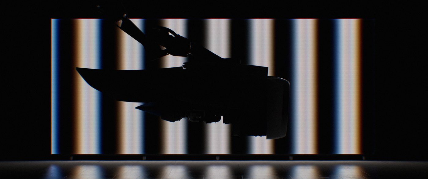
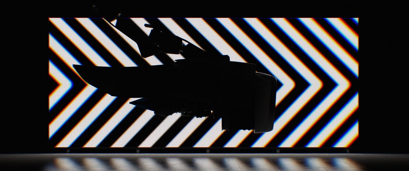
A silhouette against op-art patterns. Bold — but the engine dissolved into the pattern and became decoration.
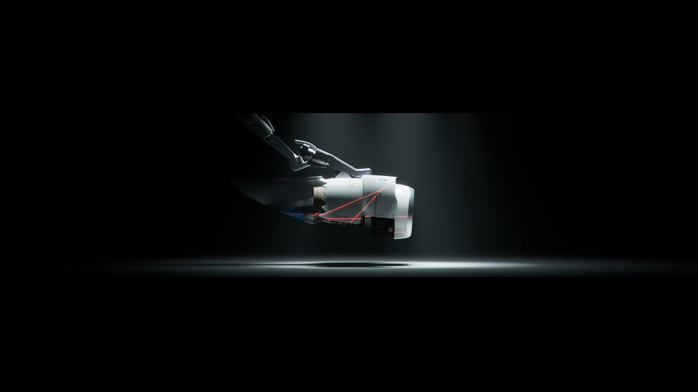
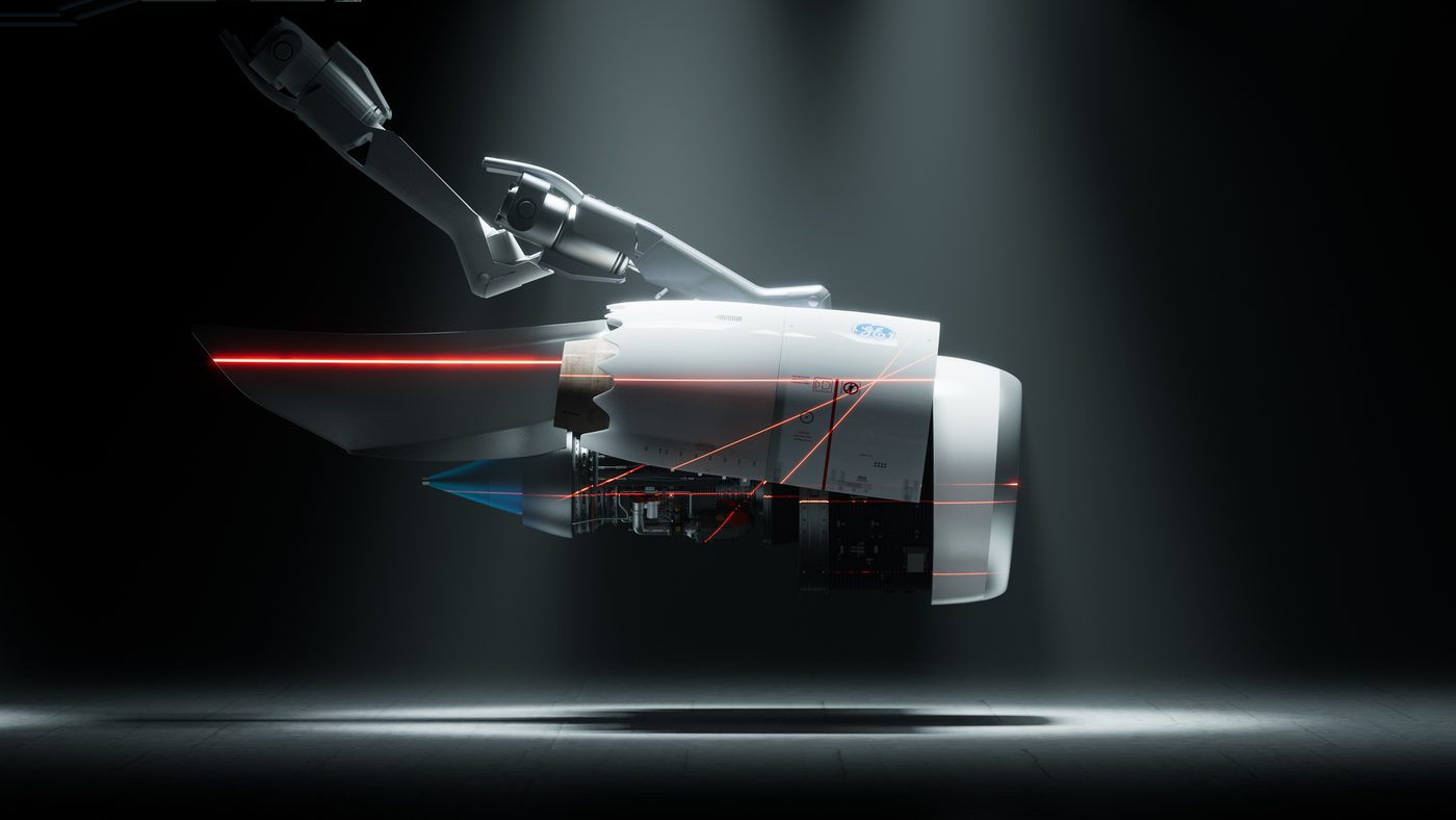
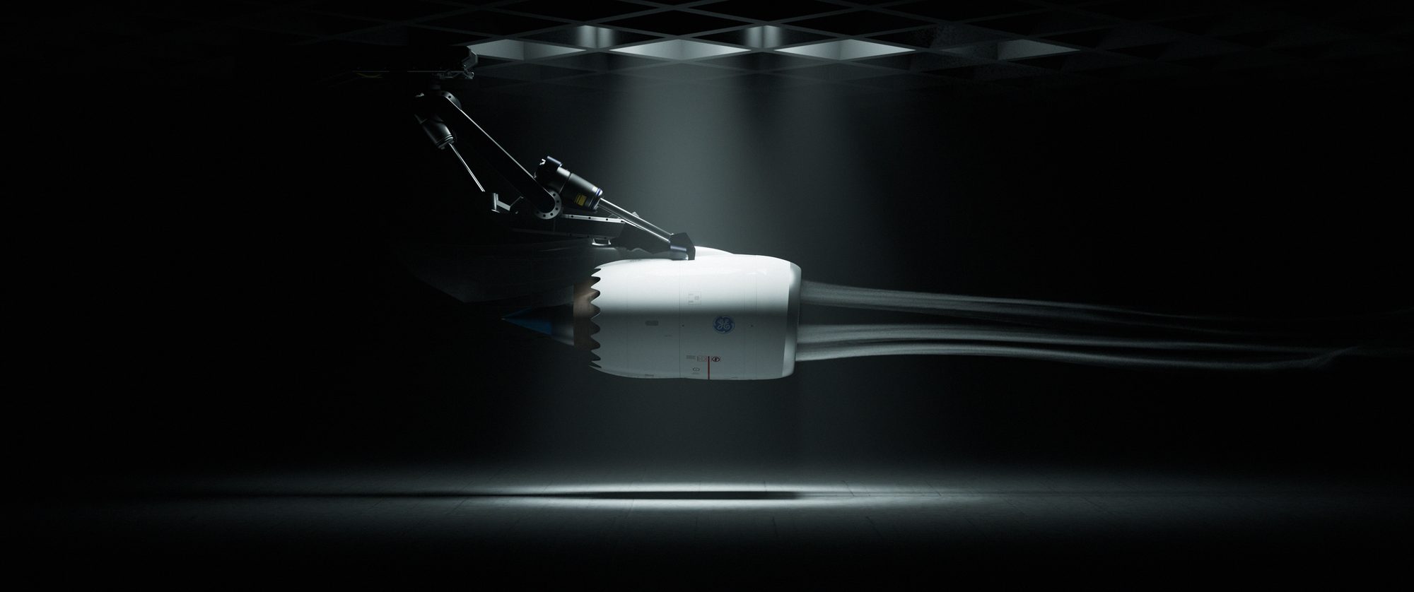
Clean product light. Precise, premium — and exactly the diagram we set out to avoid.
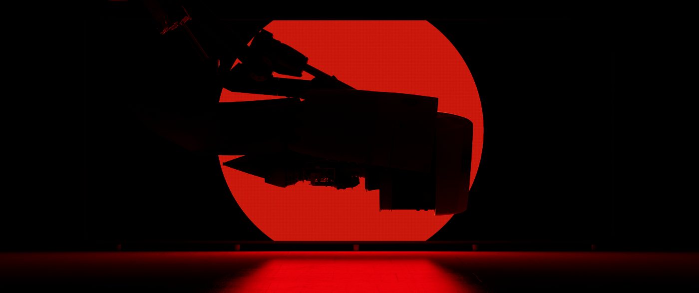
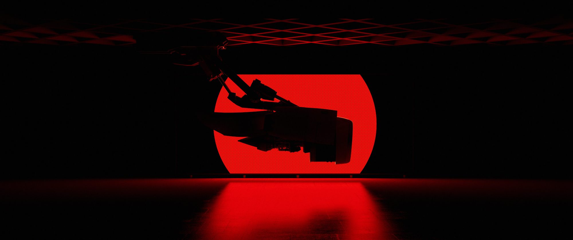
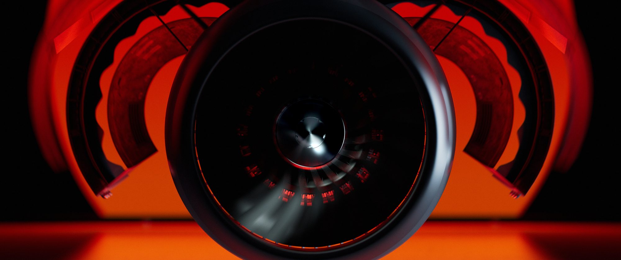
One hot disc behind a black silhouette. The engine reads as a figure against the sun — a character, not a product.

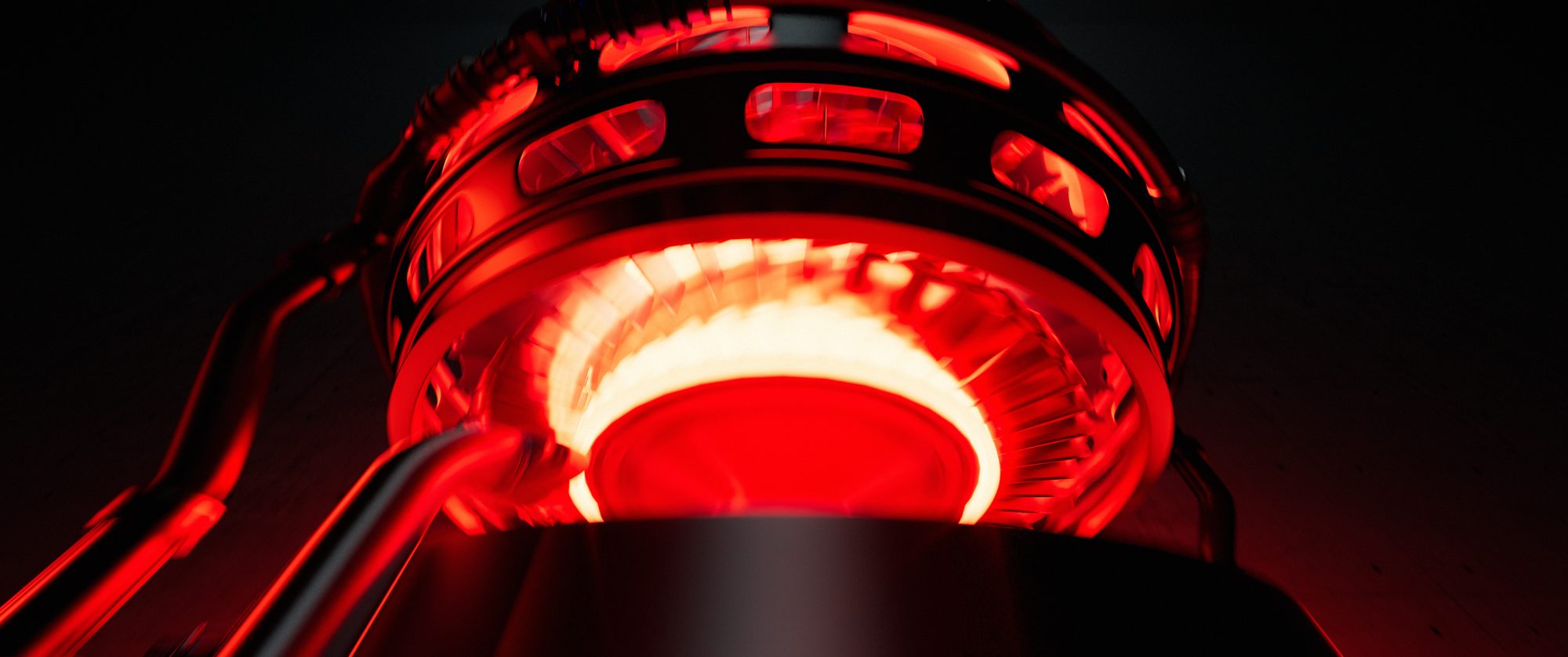
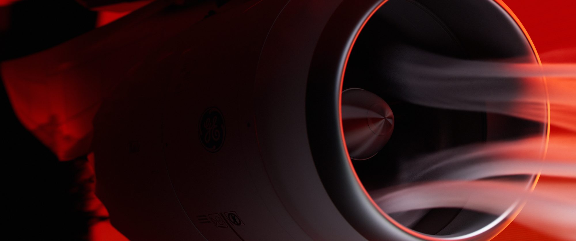
Red and orange only. No blue rim lights, no cool fill — all the tension comes from heat rising and falling.
We open on the outline and hold back the internals. Detail is a reward — it arrives once the audience has met the character.
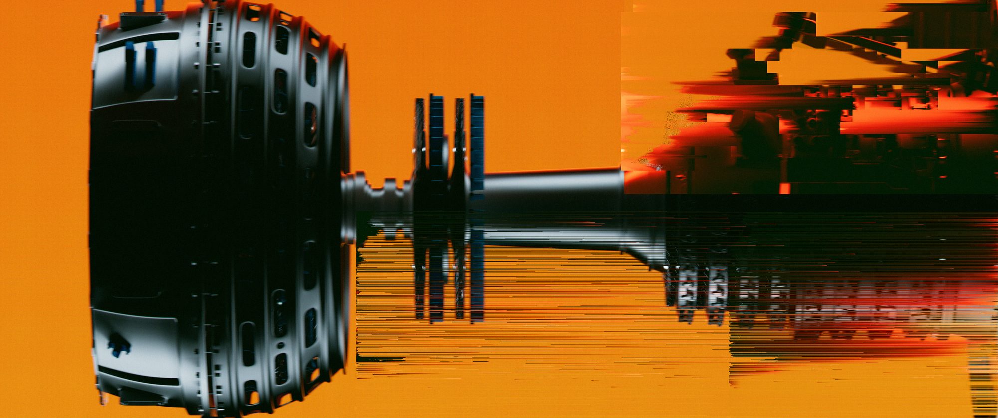
A turbine opens like a flower; a gear train pulses like a heart. Every shot had to be technically true and read as something alive.
Layout and animation were locked in grey before any lighting. Look development came last — and only on shots that had already earned their place in the edit.


“We created the piece after noticing a lack of emotionally driven motion design in the world of engineering visuals.”Oleg Lyakhov in Stash